Why you should consider color psychology before you choose a paint color


Whether you’re wondering what color to paint the office, or you’re looking to redesign your retail space, the colors you choose can increase your chance of reaching your goals. Color greatly influences human emotion and behavior.
 |
If you’re hoping to make your workers more productive, or you want to encourage shoppers to spend money, understanding the basics of color psychology can help you design a space that will maximize your potential. We’re going to explore how you can evoke emotions using color psychology.
What is color psychology? Color psychology is the study of hues that can have an effect on human behavior. Since color may have an impact on moods, feelings, and behaviors, it is important to understand its power while deciding what color to paint your commercial property. By being aware of these effects and intentionally choosing certain colors, you can evoke a specific response.
|
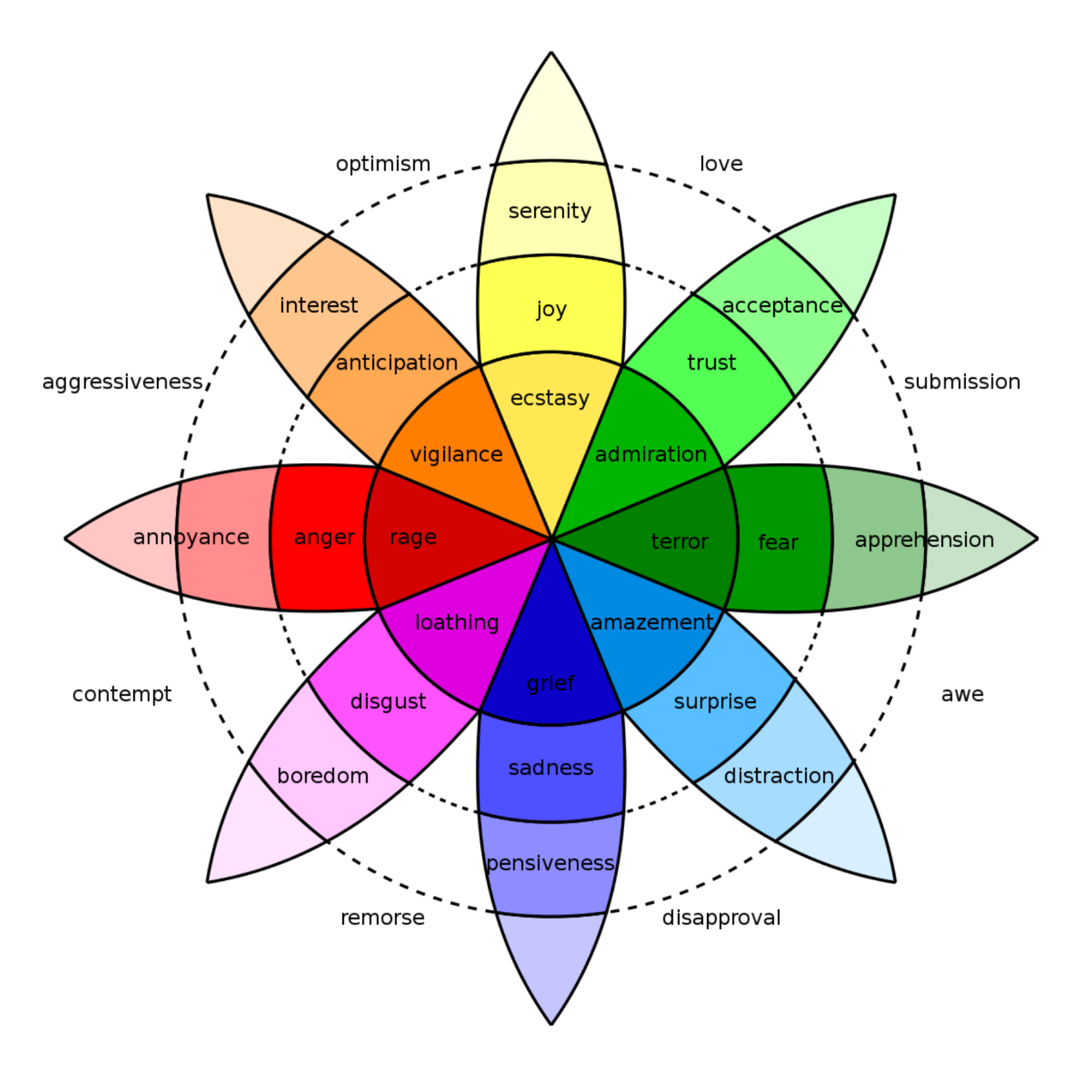
Let’s explore different color palates and what emotions they evoke.
Blue: Blue is a soothing and relaxing color choice. Blue is also an intellectual color, representing trust, logic, communication, and efficiency. It’s perfect for hotel bedrooms and bathrooms. Because blue is associated with appetite suppression it is not recommended for restaurant dining rooms or kitchens.
Red: Red evokes a feeling of passion and energy. Perfect for workout rooms or areas high energy is encouraged. Red also inspires appetite, so it’s a logical choice for restaurant dining rooms or a kitchen area.
Purple: Purple tones are immediately attractive to the eye, making them perfect for commercial areas where you want to catch someone’s attention quickly. Examples of opportunities for use of purple color palettes would be retail storefronts. Violet also makes a stunning accent color.
Yellow: Yellow is a color that reflects light making it an excellent choice for small intimate spaces that you want to feel bigger. Its cheery nature has the ability to create an uplifting mood. It represents a variety of positive emotions including creativity, friendliness, confidence, and optimism. Yellow is also a terrific choice for an accent color.
Orange: Orange color tones are friendly, happy, warm, energetic, and welcoming. Orange color palettes are perfect for common rooms or areas that are meant to influence and encourage open conversation.
Green: Green is another cool color that is considered restful. Green is actually the easiest color on the eyes, since the eye focuses the color green directly on the retina, there is no adjustment needed and it is less straining on your eye muscles. Because of this scientific fact, green proves to be a great fit in offices where people work long hours. Green also provides balance and represents harmony, nature, and restoration.
Feeling inspired about your commercial property after reading this blog? We’d love to help – connect with one of our Sales Representatives to outline how to get a rendering & color selection drawn up for your property. Let us help you evoke all the right emotions in your employees or customers.
Related Content


How To Get The Most Value Out of a Repaint
All multifamily community owners should consider repainting their buildings every 7-10 years. Once an owner makes the choice to repaint, […]
Read On

7 Reasons to Repaint Your Commercial Property This Year
Commercial painting is so much more than changing the color of a wall. Repainting your commercial property can breathe life […]
Read On

Color Selection: What your living community can do and look for
With our decades of experience helping clients transform their multi-family properties, we understand the importance of selecting the right colors. […]
Read On