Senior Living Color Trends + Color Visualizer
Color Trends We’re Seeing in the Senior Living Space
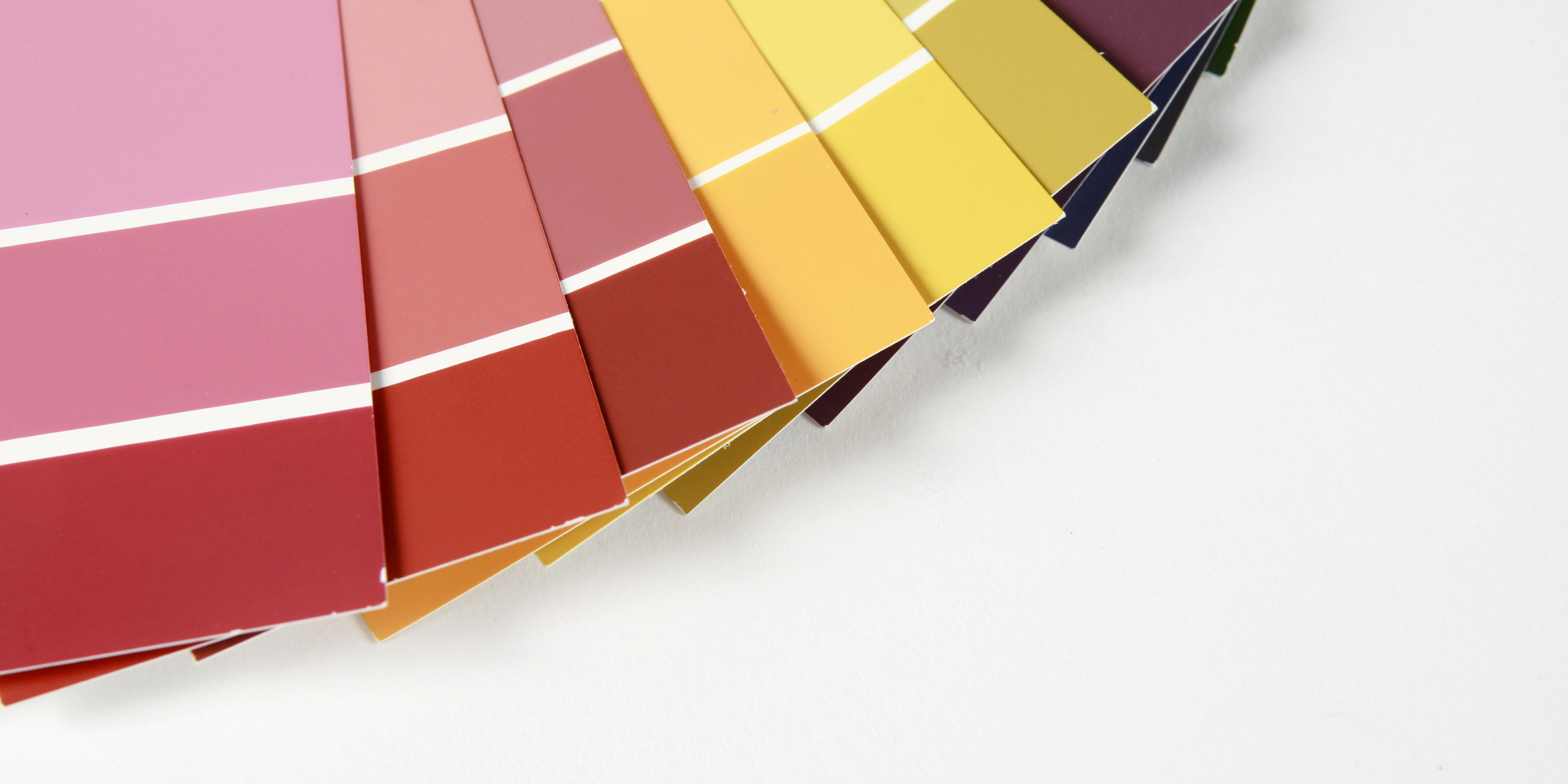
When it comes to color trends for 2022 all signs are pointing to a fresh start. Organic neutrals, warm deep reds, and pops of color like green are increasing in popularity due to their eccentric and centering effect. Sherwin Williams Colormix® Color Forecast 2022: Master Palette offers examples of color combinations that provide optimism and joy in one’s surroundings.
It’s a great mix of beige and bold color – finding that perfect mix is a great way to make a color choice that will stand the test of time, Sue M Wadden, Director of Color Marketing at Sherwin Williams commented. When asked her thoughts on putting together a lasting color palette and she said, “Colors thoughtfully focused on muted pastels… as well as natural neutrals will continue to be important. Something new popping up is nostalgia colors. Colors from the 60s and 70s that provide reassurance and comfort to the individual, we will continue to see these colors in 2022 and beyond.”
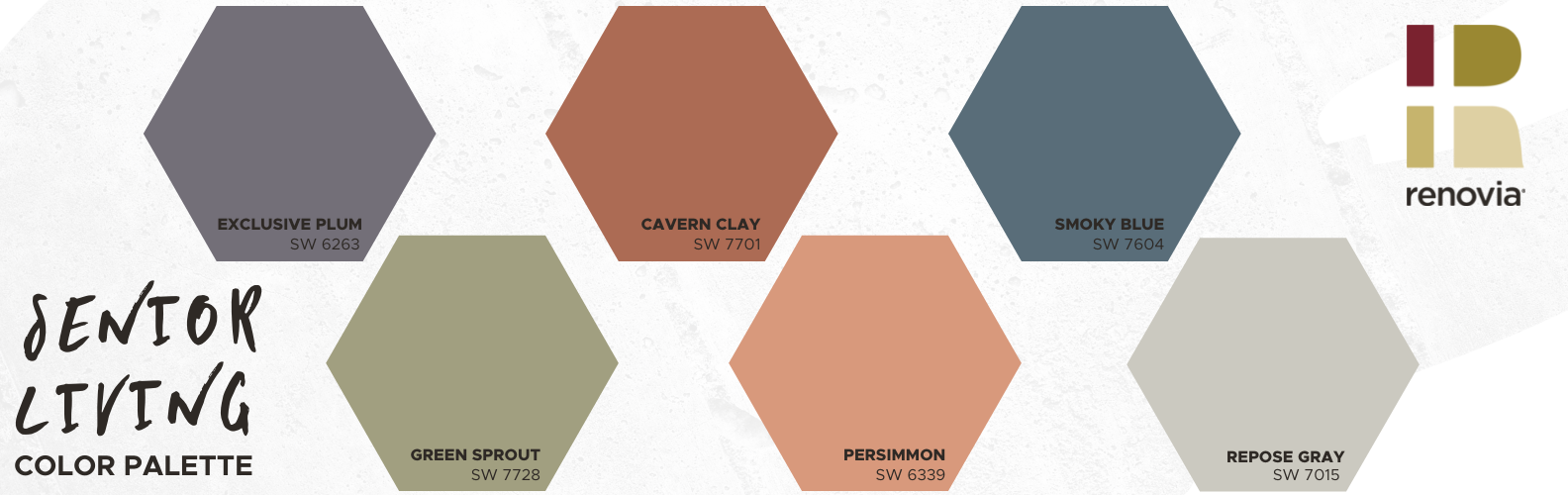
We put together some of our favorite combinations that provoke similar feelings, we’re really excited about these colors.
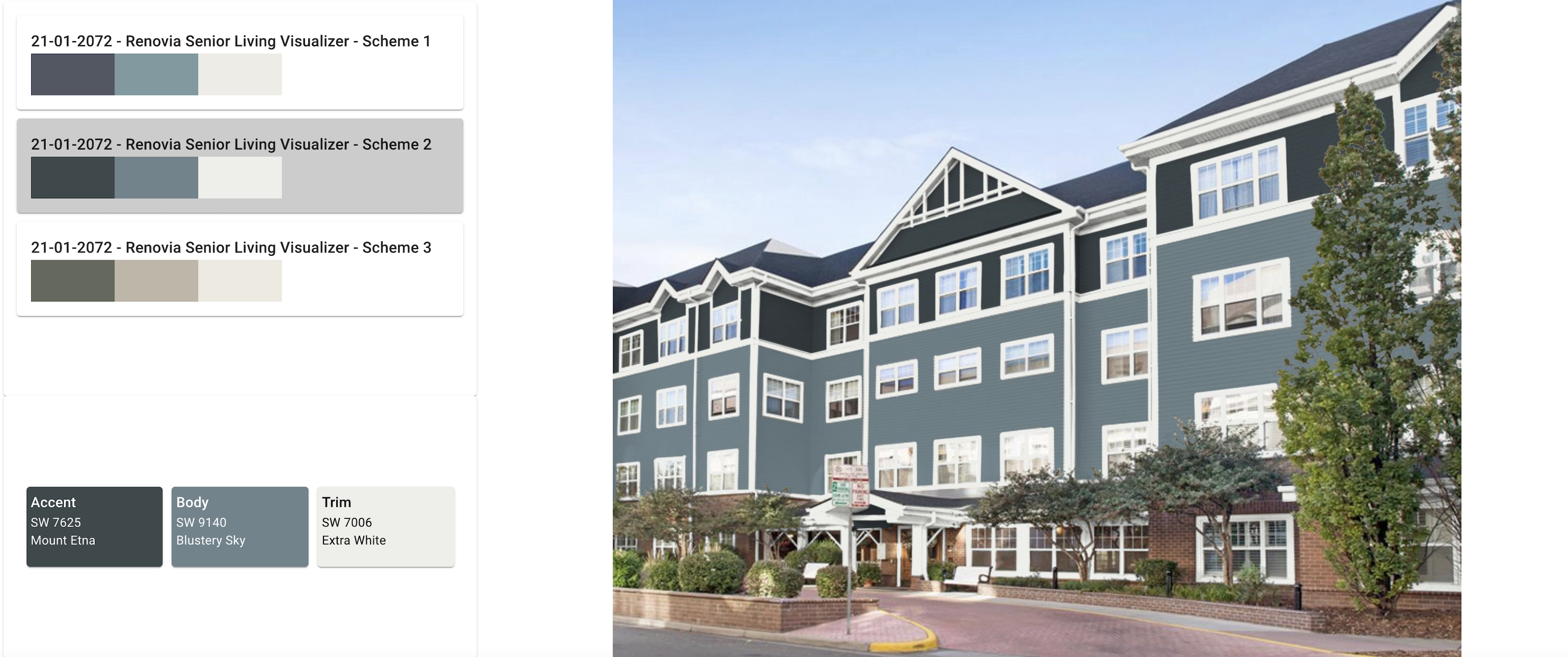
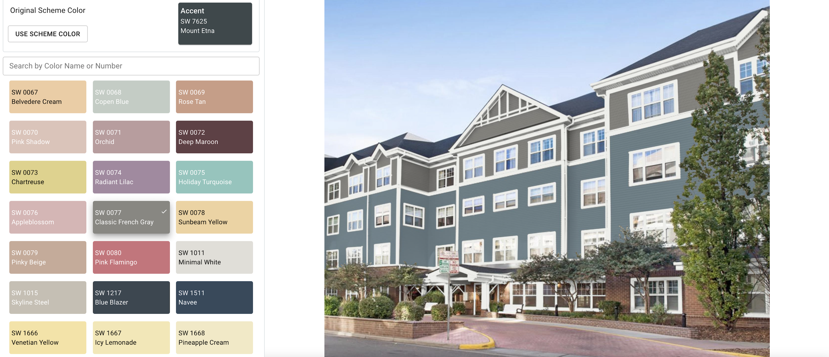
Explore Our Color Visualizer – Easy to find the right color, the first time.
We know one of the biggest fears with a commercial repaint is having buyers remorse on the color once it’s painted on your building. That’s why we encourage customers to use we Sherwin Williams Color Visualizer. It’s like trying on different looks for your building before anyone picks up a roller.
We asked Amberlie O’Toole a graphic design and photo editing expert with Design Inspired to help us understand the importance of color renderings. She stated,
“Narrowing down choices can be overwhelming. With a rendering or color visualizer, you are able to see color placement on particular surfaces alongside the surrounding elements. Landscaping, hardscapes, roof color, and other unpainted surfaces can change the appearance of adjacent paint colors. A rendering will more accurately represent how particular color choices will look as opposed to solely looking at a paint swatch. In addition, you also may want certain areas to be a focal point. A visualization tool can also help with that decision process. It is a simple, definitive way to narrow down different color schemes and combinations and arrive at the look that most appeals to you.”
Ready to try it out?
Click on the images below to try out some new and exciting combinations!
The tiles on the left allow you to change colors.
Are you ready to chat about a repaint?
Contact our team to explore a repaint for your senior living community now.

Related Content


How To Get The Most Value Out of a Repaint
All multifamily community owners should consider repainting their buildings every 7-10 years. Once an owner makes the choice to repaint, […]
Read On

7 Reasons to Repaint Your Commercial Property This Year
Commercial painting is so much more than changing the color of a wall. Repainting your commercial property can breathe life […]
Read On

Color Selection: What your living community can do and look for
With our decades of experience helping clients transform their multi-family properties, we understand the importance of selecting the right colors. […]
Read On